With the introduction of React (virtual) Code Components, Microsoft offers a new, optimized way to build code components in Power Apps. Developers can now leverage platform-provided React and Fluent UI libraries, drastically reducing bundle sizes and improving performance.
Unlike traditional Standard Code Components, where each component includes its own versions of React and Fluent UI, the new virtual components share a central React and Fluent tree within the Power Apps runtime. This reduces redundancy, optimizes load times, and ensures consistent styling across components and app sizes.
Since their introduction in 2022, Virtual Components have evolved from an experimental preview function to a mature and powerful solution for development in Power Apps.

What You’ll Learn in This Blog
In this blog, I’ll walk you through the exciting possibilities introduced by React (virtual) Code Components in Power Apps. You’ll discover:
What React (virtual) Code Components Are: How they differ from traditional components and their key advantages.
The Benefits of Virtual Components: Performance improvements, smaller bundle sizes, and simplified library management.
What Fluent UI is and how it is used in Power Apps: Learn more about the Fluent design language and the component library.
How to Build a React-Based PCF Component: A step-by-step guide to setting up, integrating Fluent UI, and deploying your custom component.
By the end of this guide, you’ll know how to leverage Virtual Components to build high-performance, modern, and efficient UI controls in Power Apps.
Key Benefits of Virtual Components
Improved Performance: Rendering through the Virtual DOM reduces memory usage and improves rendering efficiency.
Smaller Bundle Sizes: React and Fluent UI libraries are no longer embedded in individual components. Instead, they are provided centrally by the PowerApps host environment.
Simplified Library Management: Developers no longer need to manage or bundle React and Fluent UI locally, avoiding version conflicts.
Faster Development: Reduced overhead and streamlined library usage lead to quicker development cycles.
Consistent Design: By leveraging Fluent UI from the platform, the design remains consistent across all components within PowerApps.
New PCF projects created using pac CLI v1.37.4 automatically include these updated versions in the manifest.xml and package.json files.For existing projects, it is recommended to:
Update React version in the manifest to 16.14.0.
Update dependencies with:
npm updateAlternatively, reinstall dependencies:
npm installTechnical Differences Between Standard and Virtual Controls
Standard Control | Virtual Control |
Renders on their own DOM | Renders on the Virtual DOM |
Requires local React/Fluent UI libraries | Uses React/Fluent UI from the PowerApps host |
Larger bundle.js file | Significantly smaller bundle.js file |
Higher memory and CPU usage | More efficient rendering and memory usage |
Why Are Virtual Components Important?
Before the new Virtual Components, developers had to manage and bundle all required libraries locally, leading to:
Larger bundle sizes
Potential version conflicts
Slower load times
With the new Virtual Components, the PowerApps platform manages these libraries centrally. This:
Reduces development effort,
Minimizes bundle sizes, and
Improves performance and maintainability of components.
What Is Fluent Design and Fluent UI?
The Fluent Design System is Microsoft’s design language that focuses on creating engaging, accessible, and high-performance user experiences. It provides a unified design approach across platforms, ensuring consistency.
Fluent UI is Microsoft’s official React component library that brings the Fluent Design System to life. It offers ready-to-use, customizable components that align with Microsoft’s ecosystem, including Teams, Office, and Dynamics 365.

Fluent UI in Power Apps
Fluent UI controls were first introduced in Power Apps for Teams and later became the default controls for Custom Pages. By integrating Fluent UI, Power Apps ensures alignment with the overall Microsoft design language, creating a cohesive experience across various products such as Teams, Office, and Dynamics 365.
Building a React-Based PCF Component with Fluent UI DataGrid
The Power Apps Component Framework (PCF) allows developers to create custom UI components for Model-Driven or Canvas Apps. By combining PCF with Fluent UI, you can build modern, responsive, and high-performance components.
In this guide, I’ll show you how to:
Set up a PCF project,
Integrate Fluent UI’s DataGrid,
Test and push the component to Power Apps,
Add the component to a solution and use it in a form.
Step 1: Set Up Your Project
1.1 Create the Project Folder
Create a new folder for your PCF project and navigate into it:
mkdir ProgressComponent
cd ProgressComponent
1.2 Open the Folder in Visual Studio Code
Launch the folder in Visual Studio Code:
code .1.3 Ensure the Power Platform CLI is Installed
Check for the latest version of Power Platform CLI:
pac install latest1.4 Initialize a React-Based PCF Project
Set up your React-based PCF project with the following command:
pac pcf init -n ProgressComponent -ns SampleNamespace -t field -fw react -npmParameters Explained
-n: Name of the component (e.g., ProgressComponent).
-ns: Namespace for the component (e.g., SampleNamespace).
-t: Component type (field for field-bound components).
-fw react: Framework to use (React).
-npm: Automatically installs required dependencies.
1.5 Fix Vulnerabilities After Installation
After initializing the project, if npm reports vulnerabilities (e.g., 2 vulnerabilities (1 low, 1 high)), fix them with the following command:
npm audit fixThis will attempt to resolve all issues. After running the command, verify that no vulnerabilities remain:
npm auditnpm auditYou should see found 0 vulnerabilities to confirm everything is secure.
1.6 Verify ControlManifest.Input.xml Configuration
Open the ControlManifest.Input.xml file in your project directory. Look for the following <platform-library> declarations:
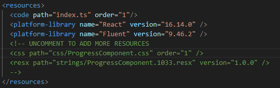
What to Check
React: Ensure the React library is included with version 16.14.0.
Fluent: Verify that the Fluent UI library is included with version 9.46.2.
1.7 Install Missing Libraries If Needed
If the required libraries (React or Fluent) are missing, install them manually using the following npm commands:
npm install react@16.14.0 react-dom@16.14.0 npm install @fluentui/react@9.46.2Step 2: Add Fluent UI DataGrid
Go to the Fluent UI React Controls documentation.
Search for the DataGrid component.
Copy the provided example code.
2.1 Adjust the HelloWorld.tsx File
Open the file named HelloWorld.tsx and add the copied code.
Step 3: Update the index.ts File
Modify the index.ts file to use the Fluent UI DataGrid component:
Navigate to and open the HelloWorld.tsx file
Check what is being exported.
In your case, the export should be:
export const Default
Adjust the Import in the index.ts file
Modify the import statement for HelloWorld in the index.ts file to match the export:import { Default } from "./HelloWorld";
Update the updateView Method Since your component does not need any context, you can directly return the component in the updateView method:
public updateView(context: ComponentFramework.Context<IInputs>): React.ReactElement {return React.createElement(Default);}By following these steps, you ensure the component is properly imported and rendered without requiring context.
The folder structure should be organized in the following way:

Step 4: Test the Component
Build the project:
npm run buildRun the Test to preview the component:
npm startOpen the provided URL (e.g., http://localhost:8181) in your browser to see the DataGrid.
Step 5: Push the Component to Power Apps
Push the component to your environment:
pac pcf push -pp wor pp: Publisher Prefix (e.g., wor).
Check your active environment:
pac auth listSwitch to the correct environment if necessary:
pac auth select -i 1Step 6: Add the Component to a Solution
Open the Power Apps Maker Portal.
Navigate to your solution.
Select Add existing > More > Developer > Custom Control.

Choose your component (ProgressComponent) and add it.
Step 7: Use the Component in a Form
Open the form editor in your Model-Driven App.
Navigate to the Components tab.

Click Get more components and search for your ProgressComponent.

Drag and drop the component into the desired form location.

Conclusion
Virtual Components are a clear step forward for PowerApps, delivering the performance and flexibility developers need for modern, scalable solutions. They not only make development faster and cleaner but also enable a better user experience with smaller, more efficient custom controls. As Microsoft continues to refine the framework, Virtual Components will undoubtedly become the standard choice for building powerful, production-ready applications in PowerApps.
Personally, I think this solution from Microsoft is brilliant. It saves a lot of time, and you don’t have to worry much about design or performance. It’s definitely a step in the right direction, and I’m excited to see how this develops in the future.
Additional Resources
For more information on Fluent UI and to get started with its components, refer to the following resources:
🔗 Fluent UI React Controls Explore available Fluent UI controls, with detailed examples, usage, and customization options for seamless integration into your Power Apps projects.
🔗 Fluent UI Get Started Guide This guide helps you get started with Fluent UI, including installation, setup instructions, and best practices for using Fluent UI components in React projects.
🔗Fluent UI Theming Learn how to customize Fluent UI components using theming and styles to match your Power Apps branding or specific design requirements.
Comments